With iOS 26, Apple significantly changed the design of the operating system. The new material, called Liquid Glass, makes controls, menus, and bars appear partially transparent. Background content shines through slightly, creating an impression of depth and light. Reactions to this were mixed. Some users found the look modern and fresh, while others were bothered by the high transparency and found the effects distracting or difficult to read. With iOS 26.1, Apple is now responding to this feedback and introducing a setting to reduce the intensity of the Liquid Glass effects.
Liquid Glass is one of the most striking design elements in iOS 26. The system uses semi-transparent surfaces that resemble glass and capture colors, light, and movement from the background. This allows the appearance to change dynamically, depending on the wallpaper or the open app.
The idea behind it is a more vibrant, fluid interface. However, the high transparency can also make text or icons harder to read. This is precisely where iOS 26.1 comes in: The update introduces a new toggle that allows users to adjust the transparency effect as desired.
Liquid Glass in iOS 26 – Design with light and depth
Liquid Glass's design concept goes beyond simple transparency. Surfaces behave as if they were made of real glass: they refract light, reflect colors, and subtly change their hue depending on the background.
Menus and buttons appear more three-dimensional and vibrant. Apple describes Liquid Glass as a material that "allows the content to show through without obscuring it." This creates an optical depth that makes the interface appear more dynamic.
For many, this was precisely the appeal of iOS 26 – a system that appears visually more open and dynamic. At the same time, however, there was also criticism: On some backgrounds, such as high-contrast or intensely colored images, text and icons were difficult to read.
Criticism and user feedback
The introduction of Liquid Glass sparked debate in the iOS community. While some praised the new design as a bold move, others were bothered by the strong transparency and the changing menu colors. The display appeared particularly distracting in bright environments or with vivid background images.
Even during the iOS 26 beta phase, many users expressed a desire for a way to reduce the transparency. Apple took this feedback seriously and promised to add such an option later.
The new switch in iOS 26.1
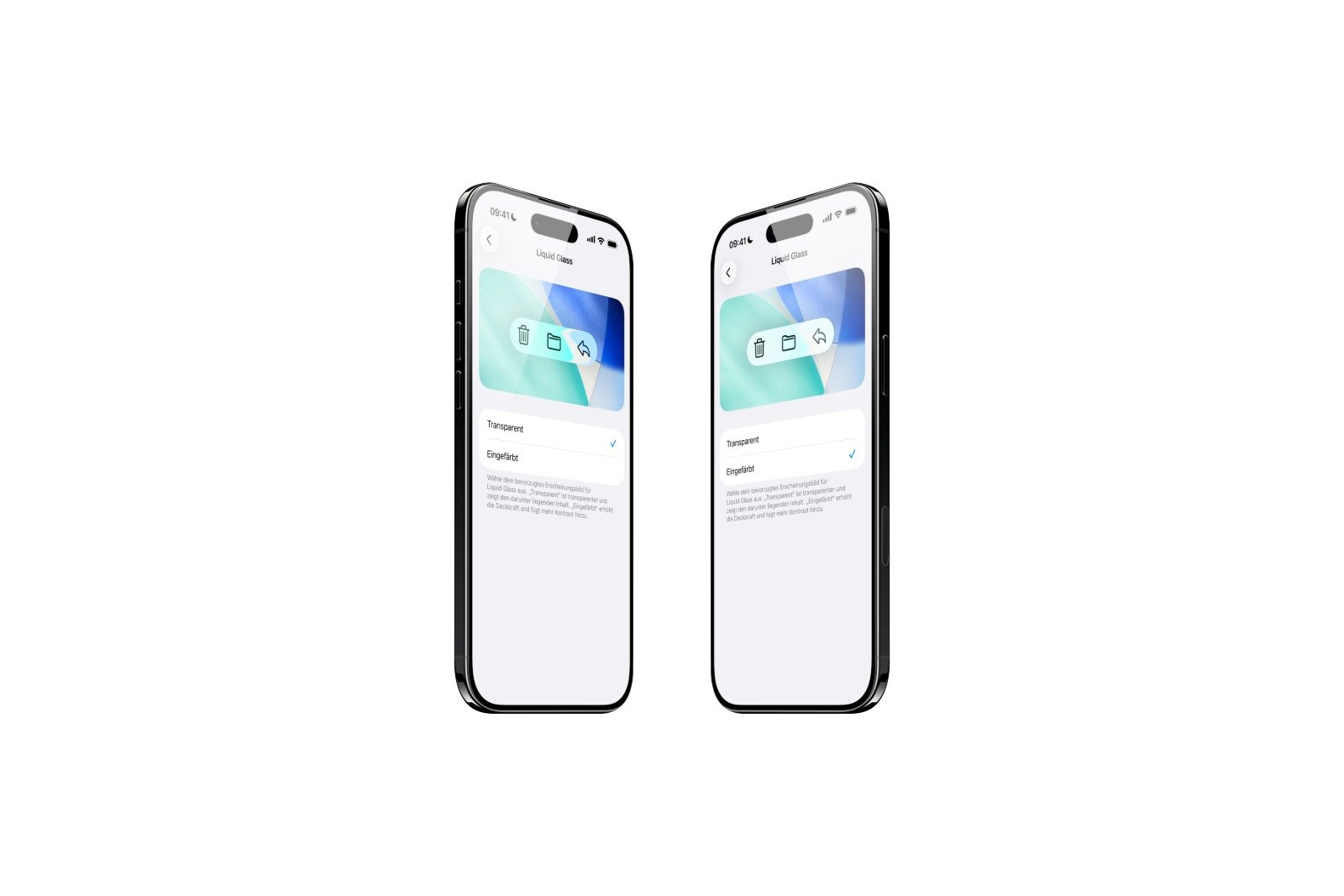
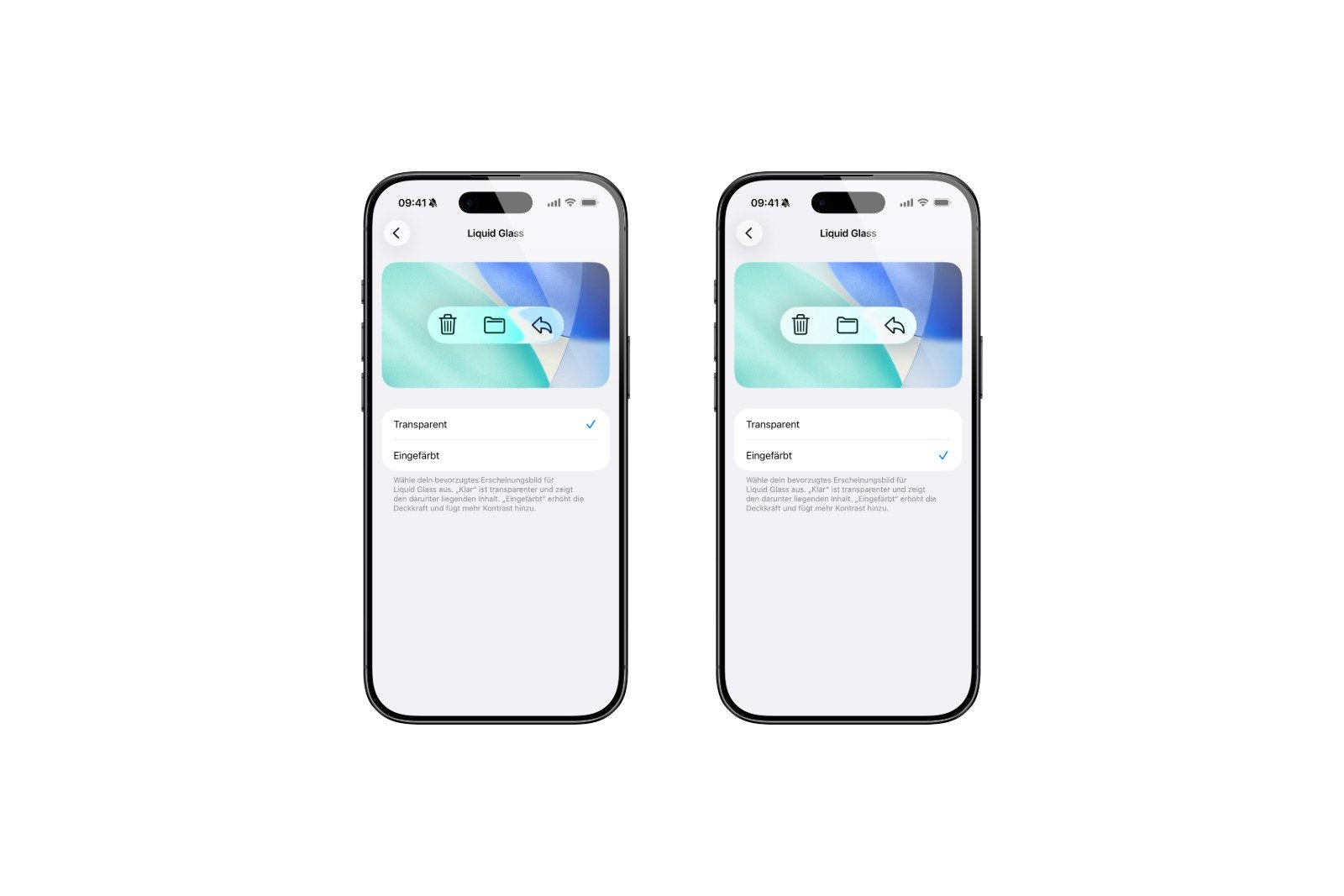
With iOS 26.1, the announced change was implemented. Apple integrated another new toggle for Liquid Glass into the system settings. This allows users to choose between two display modes:
- Clearly: The standard representation of Liquid Glass, with strong transparency and visible background.
- Tinted: A less transparent version with increased opacity and more contrast.
The new setting can be found under Settings → Display & Brightness → Liquid Glass. There you can choose between "Clear" and "Tinted". The change takes effect immediately and does not require a restart.
This option is also available on Macs: In macOS Tahoe 26.1, it can be found under System Preferences → Appearance. This ensures a consistent design across all platforms.
Why the change is important
The new switch may seem small at first glance, but it has a big impact. It gives users back control over their device's appearance. Those who like the glass design can keep it. Those who prefer better readability or a quieter display can choose the tinted version.
At the same time, iOS 26.1 demonstrates how Apple responds to user feedback. The company emphasizes that the option is based on feedback from the beta testing phase. Many testers had requested a less transparent version of Liquid Glass to improve readability.
With this, Apple emphasizes that design must not only be visually appealing, but also functional.
Liquid Glass becomes more customizable with iOS 26.1
iOS 26.1 doesn't bring any new apps or spectacular features, but it does introduce a change that's noticeable in everyday use. The new Liquid Glass switch allows users to customize the appearance more – entirely according to their personal taste.
Those who value a clean, calmer interface will benefit from the new "Colored" option. Those who prefer a vibrant, transparent look can stick with "Clear." Apple thus strikes a balance between design and usability.
The update shows that the company is willing to reconsider design decisions when they receive mixed feedback. With iOS 26.1, Liquid Glass has become not only more aesthetically pleasing but also more flexible. The best products for you: Our Amazon storefront offers a wide selection of accessories, including those for HomeKit. (Image: Apfelpatient)
- watchOS 26 brings hints about the Apple Watch dial
- macOS 26 Update: Hidden Tools and Improvements
- New call history in iOS 26: All conversations at a glance
- iOS 26: iMessage not working? Apple announces the solution
- iOS 26 Tricks: 26 small innovations with a big impact
- iOS 26 solves the Bluetooth problem with AirPods in the car
- iPhone: How the new call waiting feature works in iOS 26
- iPhone gets new feature against spam and advertising calls
- iOS 26: New option saves time and data when sending photos
- iOS 26: Over 10 hidden features everyone needs to know
- iOS 26: Visual intelligence now also for screen content
- iPhone 17: How iOS 26 colors your app icons
- iOS 26: Use polls directly in the Messages app
- New iOS 26 feature: Use live translation with AirPods
- Discover and manage games with the Apple Games app
- iPhone 17: Tips for using the Center Stage front camera
- iPhone 17 Dual Capture explained: Using the front and rear cameras
- iOS 26 Screenshot Disable full screen and enable old view
- iPhone 17: Disable or customize the camera control button
- iPhone Tip: Live Translation in Messages, Phone & FaceTime
- iOS 26: Filter messages, block spam & keep track
- Setting up your iPhone correctly: Check, block, and filter calls
- Keep an eye on your blood pressure: How the iPhone Health app helps
- Apple explains Apple Watch high blood pressure warnings
- Setting up Apple Music transitions: AutoMix or Crossfade
Frequently asked questions about iOS 26.1 and Liquid Glass
iOS 26.1 introduces a new setting for the Liquid Glass design. A toggle switch allows users to adjust the transparency of menus and interfaces to improve readability and contrast.
The switch can be found under Settings → Display & Brightness → Liquid Glass. There you can choose between the options "Clear" and "Tinted".
„"Clear" displays the standard, transparent Liquid Glass design. "Tinted" reduces transparency, increases opacity, and provides stronger contrast.
Apple responded to feedback from beta testers who wanted a less transparent display. The goal is greater flexibility and better readability in everyday use.
Yes. In macOS Tahoe 26.1, the same option is available under System Preferences → Appearance. This ensures a consistent design across all devices.
No. The change only affects the appearance. Performance, battery life, and animations remain unchanged.
Probably yes. Apple is gradually optimizing the new design material and, based on experience, responds to feedback from the community.
The Liquid Glass switch is available on all iPhones and iPads that support iOS 26 or later.
The update can be downloaded and installed as usual via Settings → General → Software update. An active internet connection is required.