With iOS 26, the iPhone gets a new look. Apple is introducing the so-called Liquid Glass design – the first major visual overhaul since iOS 7 in 2013. The focus isn't on new features, but on a fundamentally changed interface. Transparency, reflection, and a glassy appearance permeate the entire system. The update affects not only iOS, but also iPadOS 26 and macOS Tahoe. watchOS 26 and tvOS 26 also adopt elements of the new design. Apple is hailing this as a more consistent experience across all devices. At the heart of this is Liquid Glass – an interface that relies on light, movement, and depth.
Liquid Glass describes a new design language in which elements such as buttons, menus, icons, and bars are presented semi-transparently and layered. The goal is a modern, translucent look that dynamically adapts to movement and background. Many areas of the user interface are deliberately designed to be translucent, giving the system a new visual depth. The design reacts in real time. As soon as the iPhone is moved, buttons reflect points of light or subtly change their appearance. The effect is reminiscent of layered, curved glass, intended to be both functional and aesthetically pleasing.
Basic properties of Liquid Glass
Transparency permeates the entire system. Buttons allow content behind them to shine through. Colors and light from the background are absorbed, making interface elements appear to float above the actual content. Apple relies on a combination of transparency, blurring, and highlights calculated in real time. The movement of the device directly influences the appearance. Slight tilts or changes in position cause certain elements to shimmer or slightly change the perspective. The goal is a dynamic interface that doesn't appear static, but rather lively.
App icons with depth effect
The app icons in iOS 26 have a multi-layered structure, reminiscent of stacked glass plates. Colored areas are complemented by a slightly transparent upper layer, creating a subtle 3D effect. A new "Transparent" option in the settings enables a completely glassy appearance for app icons. Widgets are also made more transparent and match the look of the app icons. The basic colors of the icons remain largely unchanged compared to iOS 18.
New style lock screen
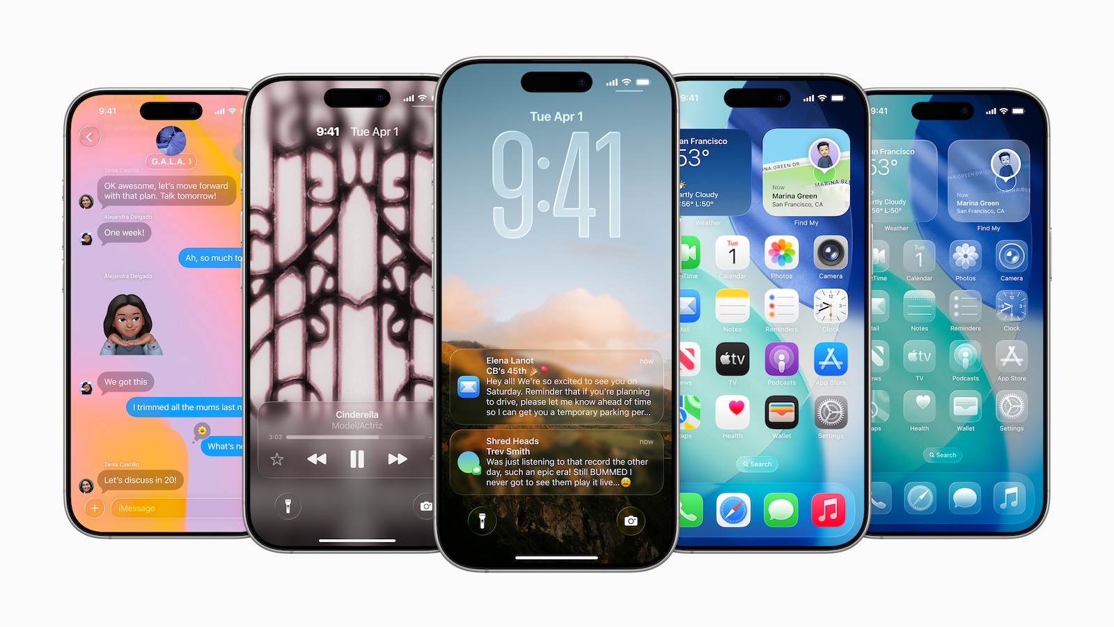
Liquid Glass is clearly visible even on the lock screen. The control buttons have a customizable glass finish. The clock has also been redesigned. It automatically adjusts its position and size to match the background, especially when a photo is being used. This way, it remains visible without obscuring the display. Notifications also use Liquid Glass, albeit in a more matte finish. Widgets on the lock screen reflect light and are integrated into the overall design. The control center buttons, the time display, and other elements are visually coordinated and follow the same design language.
Home screen and app library
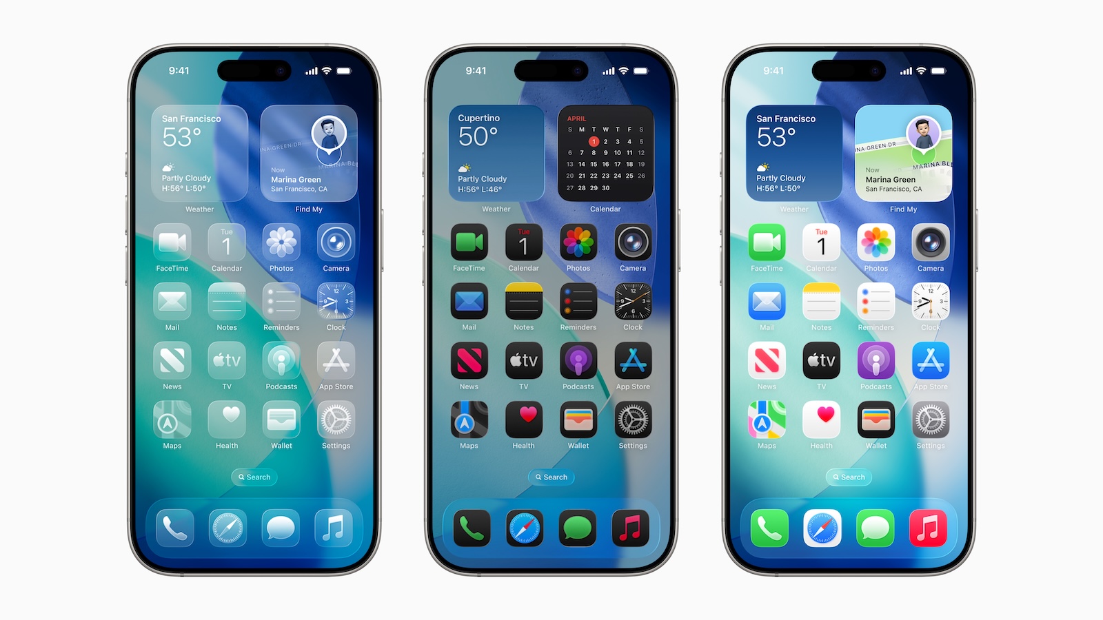
The home screen consistently incorporates the Liquid Glass design. App icons have the aforementioned multi-layered structure. If the "Clear" option is activated, they appear even more transparent. This also applies to widgets. The dock is completely transparent and visually blends in with the background. The search interface and app folders adopt the matte, slightly colored glass pattern, which varies depending on the background image. The app library also follows this style. When moving the iPhone, subtle light reflections appear on the icons, dock, and folders. Everything appears uniform without being too distracting.
Revision of the control center
In the first beta of iOS 26, the Control Center was overly transparent, making it difficult to read at times. Apple has responded by redesigning the interface. The buttons are now darker and slightly less transparent. Despite the improvements, the glassy style remains. The background is blurred more to increase contrast. The aim is to maintain intuitive interaction without sacrificing usability.
New design guidelines in Apple apps
Almost all native apps have been adapted to the new design. The changes primarily affect bars, buttons, and navigation structures. Navigation elements appear floating and often have rounded edges.
Safari
The tab bar uses Liquid Glass. It automatically hides when scrolling, leaving only the address bar visible. It reappears when scrolling back. The appearance of tab groups has been adjusted. All controls reflect the new glass style.
Photos
The Photos app now clearly distinguishes between the library and the collection. There are separate tabs and a new search function. Navigation bars disappear when scrolling. The buttons are rounded, have a glass look, and are discreetly placed.
Camera
The camera app has been redesigned the most. The main navigation has been reduced to two buttons: Photo and Video. Other modes can be accessed by swiping. Additional settings appear as a Liquid Glass-style pop-up menu.
Messages
The interface remains largely the same as in iOS 18. Only the buttons received the new design with a matte glass texture. The keyboard also appears to be adapted to the system with rounded edges and transparent borders.
Maps
Maps remains the same in structure, but all elements are rounder and more transparent. The layout has been gently revised without changing the usability.
App Store and Apple Music
Both apps now have a narrow navigation bar at the bottom. It's designed in the style of Liquid Glass. On dark backgrounds, it appears almost completely transparent. The rest of the interface has also been adapted to the new design.
More apps
Mail, Notes, Reminders, Health, and Phone also follow the new style. The unified view in the Phone app is optional. Overall, all apps receive rounder, slimmer controls, some with a transparent appearance. Functionally, most apps remain unchanged. Only Camera, Photos, and Phone have new navigation structures.
Course of design development
In the first developer beta, Liquid Glass was extremely transparent. Many controls were barely legible. This led to usability issues, particularly in the Control Center and notification area. With the second beta on June 23, Apple increased the opacity in critical areas and reduced the transparency. The lock screen and home screen were also adjusted. The third beta went even further and made the user interface less transparent overall. In the fourth beta, Apple reintroduced more transparency, albeit in a controlled form. The final design now lies between the extreme variants of the first betas. Opinions on transparency varied widely during the beta phase. Some called for more transparency, others found the design too confusing. Apple continues to try to find a balance. An adjustable slider for transparency is not planned at this time.
Consistency across all devices
The new design is also used in iPadOS 26 and macOS Tahoe. Both systems incorporate the Liquid Glass elements—the clock, dock, widgets, and system bars also follow the new style. The goal is a consistent look across iPhone, iPad, Mac, Apple Watch, and Apple TV.
iOS 26 as a style break and style model
With iOS 26, Apple is ushering in a new chapter in system design. Liquid Glass is more than just a visual upgrade—it's transforming the visual language of the entire operating system. The user interface becomes more transparent, more responsive, and more visually sophisticated. Not everyone is thrilled, but the direction is clear: Apple is focusing on movement, light, and depth as core design principles for the coming years. The best products for you: Our Amazon Storefront offers a wide selection of accessories, including those for HomeKit. (Image: Apple)
- iOS 26: 7 exciting AirPods features at a glance
- iOS 26: Everything you need to know about the new FaceTime features
- Genmoji in iOS 26: Apple gives the feature a major update
- iOS 26: Everything about the new games app for iPhone, iPad, and Mac
- iOS 26: The most important new features in the Photos app
- iOS 26: Beats and AirPods automatically pause when you sleep
- iOS 26: All Apple Music innovations at a glance
- iOS 26 expands the functionality of the HomePod
- Image Playground gets significantly better with iOS 26
- iOS 26 brings new screenshot features to the iPhone
- iOS 26: Five new lock screen features at a glance
- iOS 26 design change: Reduce transparency easily
- iOS 26: Create your own ringtones – without GarageBand
- iOS 26: All the new features for Notes and Reminders
- Apple's new Siri could be worth the wait
Frequently asked questions about iOS 26 and the Liquid Glass design
Liquid Glass is the new user interface design in iOS 26. It relies on transparency, light reflections, and multi-layered UI elements that appear like glass.
iOS 26 is compatible with all devices that also support iOS 18.
The controls remain largely the same as before. The design primarily changes the appearance—transparency, reflections, and rounded edges are the focus.
Complete deactivation isn't possible. However, there is an option in the settings to make app icons less transparent.
Almost all standard apps have been visually redesigned. Safari, Camera, Photos, Messages, Music, Maps, and the App Store are particularly affected.
Yes, some users criticize excessive transparency, especially when it's difficult to read. Apple has already made adjustments during the beta phase.
The lock screen uses transparent controls, a customizable clock, and Liquid Glass-style widgets. Everything feels more integrated and lightweight.
The Control Center is now more matte and less transparent than in the first beta. Readability has been improved with darker buttons.
Yes, iPadOS 26 and macOS Tahoe will adopt the new design. Apple is striving for a consistent look and feel across all devices.
The official release of iOS 26 is expected in the fall—most likely to coincide with the new iPhone. Apple will provide more details to follow.