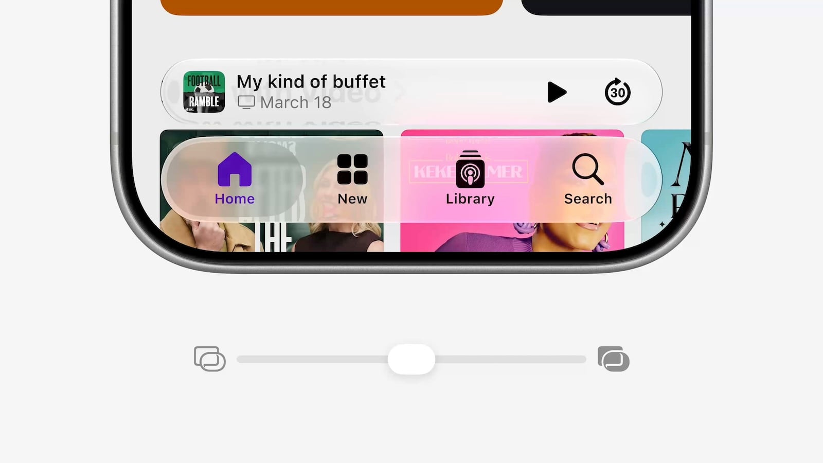
For those who found iOS's transparent interface previously allowed too much background visibility, there were essentially two options: all or nothing. With iOS 27, this becomes a freely movable slider, and the control is located in a new place within Settings. Those looking for the old switch in its familiar location will no longer find it there.
Liquid Glass has defined the look of the entire system since iOS 26: bars, menus, and controls appear semi-transparent, reflecting the color and brightness of the background. This concept extends to the home screen, where the dock, folders, and app icons have adopted the glass look. It looks elegant on muted backgrounds, but readability suffers on high-contrast photos. Apple has been gradually improving the system since its launch – and with iOS 27, it replaced the either-or decision with a scale that allows for any intermediate value.
Where the setting is located in iOS 27
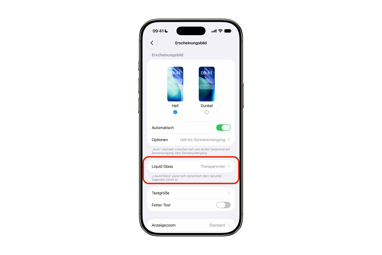
The path has changed. The controls are no longer located under "Display & Brightness", but in a separate area called "Appearance", which bundles the system's design options.
- Open the app settings.
- Tap on Appearance.
- Tap on Liquid Glass.
- Drag the slider to the left for more transparency or to the right for more opacity.
The preview redraws in real time as you drag. This allows you to assess the result directly, without leaving the settings and checking elsewhere. A restart is not necessary; the change takes effect immediately.
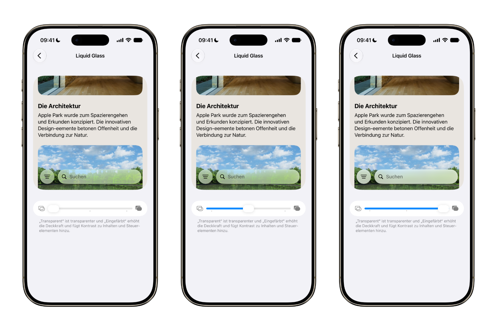
Upon first launching the app after updating to iOS 27, the system automatically displays the slider. If you quickly tapped away from it, you can always find it again via the menu at the top.
Three markings, but no grid
The scale has three labeled points that serve as a guide:
- Transparent on the far left represents the look for which Liquid Glass has become known: maximum transparency, background and wallpaper clearly show through the controls.
- The standard setting in the middle is the default setting of iOS 27 and blends visible transparency with usable readability.
- The more tinted area on the far right noticeably increases the opacity and reduces visibility without completely removing the glass-like appearance.
The crucial point is that the slider doesn't lock into place at these points. It can be moved freely and left at any position between two markings. If you find the default setting a touch too transparent, simply slide it slightly to the right without immediately reaching the "More tinted" setting. The three labels are therefore indicators, not selection options.
Important for users switching from iOS: The names have also changed. What was called "Clear" and "Tinted" in iOS 26.1 is now called "Transparent" and "More Tinted".
The new standard looks different from iOS 26
Apple has not only added adjustable settings but also revamped the basic look. Complex content behind a glass surface is darkened more, and the separation between layers is more pronounced.
Anyone who feels the interface is calmer after the update, without having changed any settings themselves, is correct. The middle setting is not the same as the default setting in iOS 26.
What else can be found in the new area?
Liquid Glass isn't the only feature found under "Appearance." Apple has gathered several options there that were previously located under "Display & Brightness": switching between light and dark mode, text size, bold text, and display zoom. Anyone looking for these settings in their usual location after the update will be disappointed.
Another entry works differently than the others. "Reduce Motion" remains an accessibility option, but it is displayed in the Appearance section and can be toggled directly there. Additionally, from this location, there is a link to the Accessibility settings themselves, should further adjustments be necessary. It is therefore the same toggle in two places, and not a separate, independent setting.
This point is particularly important for Liquid Glass because the design not only works with transparency but also with movement: surfaces deform when scrolling and opening menus. Those who find the interface distracting will often find the slider alone insufficient – the second lever is located right next to it.
What remains in "Display & Brightness"
The old section hasn't disappeared, it's just become significantly shorter. What remains are True Tone, Night Shift, automatic screen lock with its time interval, lift-to-wake, and – on devices with a compatible display – "Always On." There's also a link to the accessibility options.
There's a clear dividing line behind this: "Display & Brightness" now only contains settings that technically control the display, such as color temperature, brightness behavior, and sleep mode. Everything related to the user interface's appearance has moved to "Appearance." Once you remember this division, you won't have to guess which of the two menus contains a particular setting after the update.
Where the change will have an impact
This setting applies system-wide, not just to specific areas. It affects, among other things, the Control Center, folders on the home screen, on-screen controls within apps, and notifications on the lock screen.
This is precisely where most people decide whether the effect is bothersome: A notification superimposed on a bright photo is harder to see with high transparency than one placed on a muted background. Therefore, after changing the settings, don't just check the settings themselves, but also take a look at the lock screen and the control center.
Even if the right end isn't enough
Even with the "More tinted" setting, the surface retains a slight glass-like appearance. For those who still find this too much, two options in the accessibility settings offer further relief. Both are located under Settings → Accessibility → Display & Text Size.
- Reducing transparency removes almost all transparency and replaces it with flat, opaque backgrounds.
- Increasing the contrast enhances the distinction between buttons, text, and what lies behind them.
These two switches are not a replacement for the control, but rather a step above it: they intervene more decisively and change the appearance more noticeably, but the glass effect virtually disappears. For people with impaired vision, this is often a better choice than the control alone.
From two-stage switch to free scale
The development process involved several intermediate steps, which regularly leads to confusion in forums. iOS 26.1 introduced the first change: a toggle switch under "Display & Brightness" with two positions, "Clear" and "Colored." While iOS 26.2 added a slider, this only controlled the display of the time on the lock screen and not the system settings.
According to reports from the spring, system-wide fine-tuning was already planned for iOS 26, but failed at the time due to technical implementation issues across all interfaces. With iOS 27, it's here – and replaces the two-step switch instead of remaining alongside it.
| Version | What was controllable | Where it was |
|---|---|---|
| iOS 26 | nothing | – |
| iOS 26.1 | two fixed levels: "Clear" and "Tinted" | Display & Brightness → Liquid Glass |
| iOS 26.2 | Additionally, stepless adjustment is possible, but only for the lock screen clock | Lock screen editing |
| iOS 27 | Continuously adjustable for the entire system, three markings for orientation | Appearance → Liquid Glass |
The same applies to iPad and Mac
iPadOS 27 places the setting in the same location; the path via "Appearance" is identical. On a Mac, the slider is located in System Preferences under "Appearance," also within the Liquid Glass section. Both accessibility options are available on all three platforms.
Users of multiple Apple devices must adjust the setting on each device individually – the value is not synchronized via the Apple account.
Adjusting Liquid Glass – the most important points at a glance
The slider under "Appearance" is the key setting for anyone who hasn't been comfortable with iOS's transparency. The middle position, "Standard," is the new default and already more understated than what iOS 26 offered. Moving it to the left makes the interface more transparent, while moving it to the right makes it calmer and more opaque – and because there's no click-stop function, every value in between is possible.
If that's not enough, the "Reduce Transparency" and "Increase Contrast" options in the accessibility settings take a much more drastic approach. The combination of both caters to virtually every taste – from a fully glass-like appearance to a surface where the design concept is barely noticeable. (Image: Apple)
- iOS 27: Hide audio and dictation icons in Messages
- Detecting stalkerware on the iPhone
- iMessage contact key verification explained
- Installing iOS 27 Public Beta: Instructions, risks and troubleshooting
- Disable Apple Intelligence: How to turn off the AI
- Apple Notes: Record audio and convert it to text
- Apple Intelligence and Data Privacy: How Apple Protects Your Data
- Create iPhone ringtones – without GarageBand
- Create Genmoji: Custom emojis with Apple Intelligence
- Image Playground: Create unique images on your iPhone
Frequently Asked Questions: Adjusting Liquid Glass Transparency
No, there's no off switch. The slider under "Appearance" significantly reduces the effect, and "Reduce Transparency" in the Accessibility settings removes almost all transparency. However, a complete return to the pre-iOS 26 design isn't possible.
No. "Transparent," "Standard," and "More tinted" are merely labeled reference points on the scale. The slider does not lock into place at these points and will remain at any position in between.
This setting only exists from iOS 27 onwards. In iOS 26, the control is still located under "Display & Brightness → Liquid Glass" and only offers the two fixed levels "Clear" and "Tinted".
With iOS 27, it moved to the new "Appearance" section, along with Light and Dark mode, "Bold Text," and Display Zoom. The Liquid Glass slider is also located there. "Display & Brightness" remains, but no longer includes these options.
Apple has revised the default look with iOS 27. Content behind glass surfaces is darkened more, and the layers are more clearly separated. The middle position of the slider corresponds to this new standard, not the appearance in iOS 26.
The slider adjusts the intensity within the design while maintaining the glass-like appearance. "Reduce transparency" is a user-friendly feature that replaces translucent areas with solid, opaque backgrounds.
No. The value is not synced via the Apple account and must be set individually on iPhone, iPad, and Mac.