
With iOS 26, Apple is introducing a comprehensive redesign of the iPhone design. The update introduces the new Liquid Glass look, which relies on transparent elements, and fundamentally changes the appearance of the home screen. For the first time, app icons can be made completely transparent. This innovation applies not only to the iPhone, but also to the iPad and Mac.
For years, icon design has been limited to light and dark versions. With iOS 26, the home screen becomes more flexible and customizable. Apple has not only redesigned its own apps but also introduced new customization options. In addition to colored icons, there are now transparent displays and an additional mode called "Colored." This noticeably changes the way icons and widgets look on iPhone, iPad, and Mac.
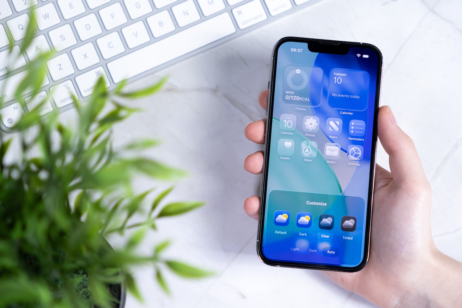
Enable transparent app icons
Using transparent icons on your iPhone only requires a few steps. First, hold down an empty area on the home screen until the icons start to jiggle. The "Edit" button will then appear in the top left. Selecting "Customize" will open a menu at the bottom where you can set the icon styles. In addition to the existing "Light" and "Dark" options, "Transparent" is also available. If "Transparent" is selected, all app icons will appear transparent and blend in more closely with the background. To save the setting, simply tap an empty area on the home screen. If you want to go back to the classic icons, repeat the steps and select "Standard".
Icon variants in iOS 26
By default, "Light" is the active icon style. However, with iOS 26, the following variants are available:
- Transparent: Symbols appear transparent and blend into the background.
- Dark: App icons appear in a darkened version.
- Standard: The display automatically switches between light and dark, depending on the selected system mode.
- Colored: A new mode that combines transparent icons with different brightness levels. Choose from "Light," "Dark," and "Auto."
By expanding the options, it is now possible for the first time to adapt the look of the home screen much more closely to your own system design.
Transparent icons on iPad and Mac
The new design options aren't limited to the iPhone. With iPadOS 26, transparent and tinted app icons can also be used on the iPad. Widgets are also customized, giving the entire home screen a uniform look. Furthermore, multiple home screens can be set up, each with its own unique design. This feature is also making its way to the Mac. With macOS Tahoe 26, in addition to transparent icons and "tinted" mode, there is a selection of dark icons for the first time. This option can be found in System Preferences under "Appearance" in the "Icon & Widget Style" section.
Meaning for the home screen
The switch to transparent icons significantly changes the perception of the home screen. While the elimination of colors makes apps less easily recognizable by their icons, the overall impression is more modern and streamlined. The bright transparent options on the iPad, in particular, create a futuristic appearance. Apple is thus implementing the biggest visual innovation since the introduction of widgets.
More freedom on the home screen with iOS 26
With iOS 26, Apple is expanding the customization options for iPhone, iPad, and Mac. Transparent icons, the new "Colored" option, and additional options like "Dark" and "Auto" open up a flexible design system. Combined with the new Liquid Glass look, this creates a clean, modern home screen that's more personalized than ever before. Time for fresh accessories? Visit our Amazon Storefront and discover a wide selection of products from leading manufacturers, including HomeKit-compatible ones! (Image: Shutterstock / aileenchik)
- Make the most of your iPhone Reminders app – 7 professional tips
- iOS 26: Apple Music finally gets folders for playlists
- Share only specific photos with apps like Facebook – here's how
- iOS 26: Capture reminders faster and easier
- Use AirTag efficiently – 7 practical tracking tips
- Make the most of iPhone screen time – 7 effective tips
- Optimize iPhone battery health: 7 tips to save battery life
- Extend iPhone battery life: These 7 tips help immediately
- Using iPhone Accessibility Features: 7 Features at a Glance
- Apple Intelligence: From which iPhone is it available?
- iPhone & Co.: How to deactivate the advanced visual search
- Extend iPhone battery life: These 7 tips help immediately
- Editing iPhone RAW photos – 8 simple pro tips
- iPhone & Co.: How to deactivate the advanced visual search
- Extend iPhone battery life: These 7 tips help immediately
- Setting up iPhone widgets: These 6 tricks you need to know
- Set up Apple Pay on your iPhone – quickly and securely
- Why an iPhone? These advantages are convincing in the long term
- Secure your iPhone properly: 5 important functions at a glance
- Save iPhone battery: When is power saving mode worth it?
- Use Apple Wallet safely, conveniently, and efficiently – 7 tips
- LG or Samsung Smart TV? How to disable tracking
Frequently asked questions about iOS 26 and transparent icons
iOS 26 brings the new Liquid Glass design concept, transparent app icons, the “Colored” mode and advanced options such as “Dark”.
On the home screen, tap and hold an empty area, select "Edit," then "Customize." From the menu, select the "Transparent" icon style.
Yes. You can repeat the steps for customizing the icon. Instead of "Transparent," simply select the "Standard" option.
The options are Standard, Light, Dark, Standard, Transparent and the new “Colored” mode in various variations.
Yes. iPadOS 26 supports transparent icons and widgets. macOS Tahoe 26 also offers transparency, dark icons, and "Inked" mode.
Yes. In "Transparent" mode, not only app icons but also widgets adapt visually and take on the same transparent look.
Apps are a little harder to recognize due to the lack of colors, but the home screen looks more modern, tidy, and futuristic.
Because Apple offers complete transparency for icons for the first time and introduces a consistent look across iPhone, iPad and Mac with Liquid Glass.